Seventy to eighty percent of adult traffic in 2026 arrives on a phone. Most of that is Android, with a meaningful iOS minority and a tiny tablet sliver. A site designed for desktop first and then “made responsive” is a site hemorrhaging conversion on the majority of its visitors.
This post is the 2026 mobile-first UX playbook: layout patterns, tap-target discipline, ad-density trade-offs, the specific performance budgets that matter on phones, and the edge cases that break if you ignore them.
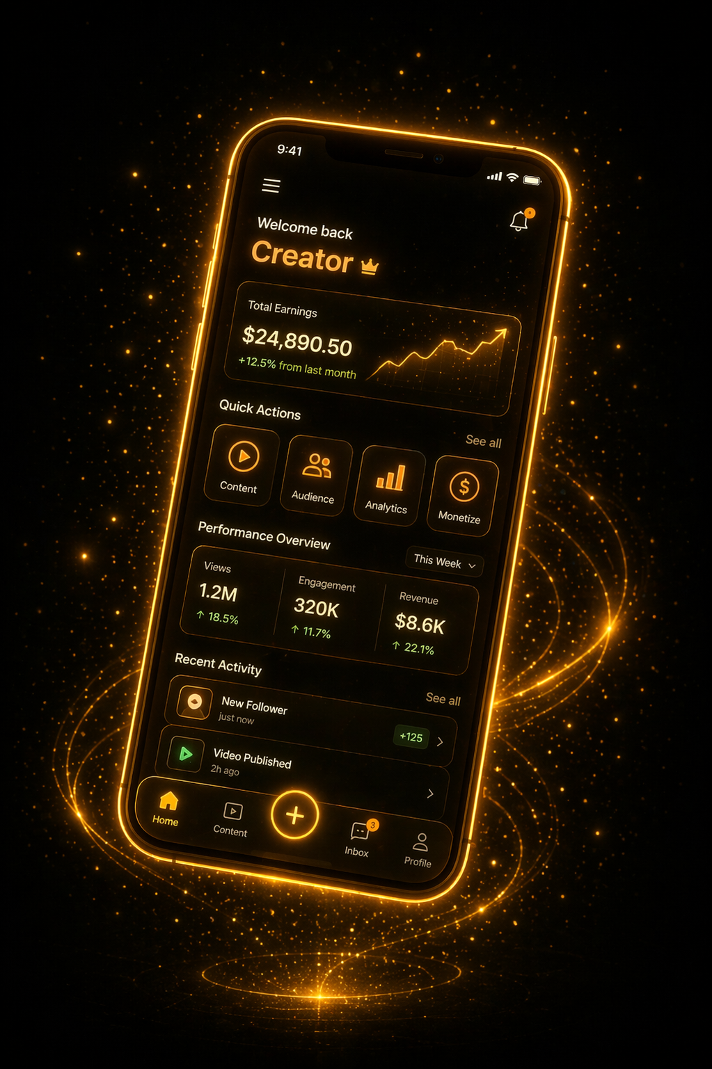
Why Mobile-First Matters More in Adult
- Adult browsing happens often in private, brief sessions — phone is the default.
- Mobile traffic is cheaper from ad networks but lower-converting unless UX is dialed.
- Mobile Core Web Vitals are now a ranking factor across all niches.
- A 1-second mobile slowdown cuts conversion 10–20% in adult (same pattern as ecommerce).
Layout Primitives for Mobile Adult
Thumbnail Grids
- 2 columns on portrait phones (typical).
- 3 columns on landscape / small tablets.
- Minimum thumbnail width: 160px for 16:9 thumbs (320px on retina).
- Consistent aspect ratio — don’t mix 16:9 and 4:3.
- Preview-on-hover doesn’t work on touch — replace with animated GIF preview on scroll.
Video Player
- Fullscreen on mobile must default to landscape orientation lock.
- Poster image shows before playback; no autoplay (battery, data, and iOS safari restrictions).
- Tap-to-play — single large play button is the only CTA above the fold.
- Picture-in-picture support (iOS Safari 14+, Android Chrome).
- Double-tap to skip 10s forward/backward (YouTube pattern users expect).
Navigation
- Bottom nav bar (thumb-reach zone) with 4–5 primary tabs.
- Sticky search at top collapses on scroll.
- Hamburger menu for secondary navigation — but don’t bury everything there.
- No horizontal scrolling anywhere — universally despised.
Tap Target Discipline
- Minimum 44x44 px tap target (Apple HIG); 48x48 dp on Android.
- Spacing: at least 8px gap between adjacent tap targets.
- No text-link-only actions on mobile — buttonify.
- Sticky CTAs: the primary action should be reachable without scrolling.
Performance: Mobile Core Web Vitals
| Metric | Target | Impact |
|---|---|---|
| LCP (Largest Contentful Paint) | ≤ 2.5s | SEO + conversion |
| INP (Interaction to Next Paint) | ≤ 200ms | Perceived responsiveness |
| CLS (Cumulative Layout Shift) | ≤ 0.1 | Frustration + misclick ads |
| First-input delay equivalent | Fast | Doesn’t feel janky |
Achieving These on Mobile
- Preload poster image above the fold.
- Defer all ad scripts until user interaction or scroll.
- Lazy-load below-fold thumbnails.
- Reserve space for thumbnails (width/height attributes) to avoid CLS.
- Inline critical CSS, defer the rest.
- Split JS; load page-specific code lazily.
- Serve WebP/AVIF images.
- Minimize render-blocking requests.
Ad Placement That Still Pays
Mobile ad density is the biggest tradeoff in adult UX. Too little = lost revenue. Too much = bounced users + ranking penalty. Patterns that work:
Ad-Free Zones
- No ads between play button and first scroll.
- No ads in the bottom nav bar.
- Ad zones visually distinct from content (not disguised as thumbs).
Allowed High-Performance Slots
- One sticky banner bottom of screen (not overlapping bottom nav).
- In-feed native unit every 8–12 thumbnails.
- Interstitial between navigation events (max once per session).
- Pre-roll on video (but be careful — heavy pre-rolls bounce users).
- Post-roll before “next video” thumbnail recommendations.
Slots to Avoid
- Full-page pop-up that covers the player.
- Auto-playing video ads with sound (iOS breaks silently; Android users bounce).
- “Continue reading” gate — modal blocking content.
- Nag bars that can’t be dismissed.
Conversion-Flow Patterns
The three most important conversion flows to optimize for mobile:
1. Video Play → Affiliate Click
- Single dominant CTA near the player.
- Tap opens affiliate in new tab (don’t lose your user).
- Preload the linked destination for snappier perceived speed.
2. Anonymous Browsing → Registration
- Email-only or email + password signup.
- Social login optional (not always available in adult — check provider ToS).
- No credit card at registration — separate trial flow.
- Fields stacked vertically; input type attributes set (email, tel, password).
- Big primary submit button, thumb-reachable.
3. Free User → Paid Subscriber
- Upsell at peak intent moments: after watching 2–3 videos, at 80% through a preview, etc.
- Prices and inclusions clear at a glance.
- One-step checkout; no multi-page wizards.
- Payment method selection (card, crypto, etc.) before committing to price.
- Trial offers visible but not the primary CTA (trial users convert to paid at lower rates than annual-first users).
Edge Cases That Break Mobile UX
- Safari’s autoplay policies — test muted-autoplay paths specifically.
- Safe-area inset on iPhone (notch/home-indicator) — use
env(safe-area-inset-*). - Pull-to-refresh conflicting with your gesture handling.
- Android back button: use History API correctly or users get launched off the site.
- Keyboard covering input fields — scroll-into-view on focus.
- Dark-mode preferences — support
prefers-color-scheme.
Accessibility Is Not Optional
- Alt text on every image.
- ARIA labels on icon buttons.
- Sufficient color contrast (4.5:1 for text).
- Focus states visible.
- Respect user’s reduced-motion preference.
Accessibility helps you in SEO, in ADA-compliance liability, and with users across ability spectra.
Testing
- Real-device testing on at least 3 Android + 2 iOS devices.
- BrowserStack or Sauce Labs for wider coverage.
- Chrome DevTools mobile emulation for rapid iteration.
- Real-world connection throttling (3G / slow-4G profile) — not everyone is on fiber.
- User testing sessions with real users on real devices, recorded.
Closing Thought
Mobile UX is the discipline that separates sites that convert from sites that don’t. Get the layout primitives right, respect the performance budget, cap ad density to the sustainable level, and optimize the three key conversion flows. Do that and your mobile user — the majority of your audience — has an experience that actually earns their second visit.